As the sole designer on this project, I designed a solution the checkout experience’s user interface inconsistencies, created a solution for add-on variation display and an add-on gallery view.
Universe is an event management and ticketing platform that provides event organizers a place to create, list and manage their events, and for attendees to purchase tickets for them.
Research
Ideation
Hi-Fidelity Design
Prototyping
Presentation
Figma
Jira
Nikki Policarpio (Product Designer)
Wasiq Wadud (Product Manager)
There were recurring issues being brought up within the Universe team regarding the add-on checkout experience and requests from clients regarding possible new features.
How can we design solutions to these user interface inconsistencies and opportunities?
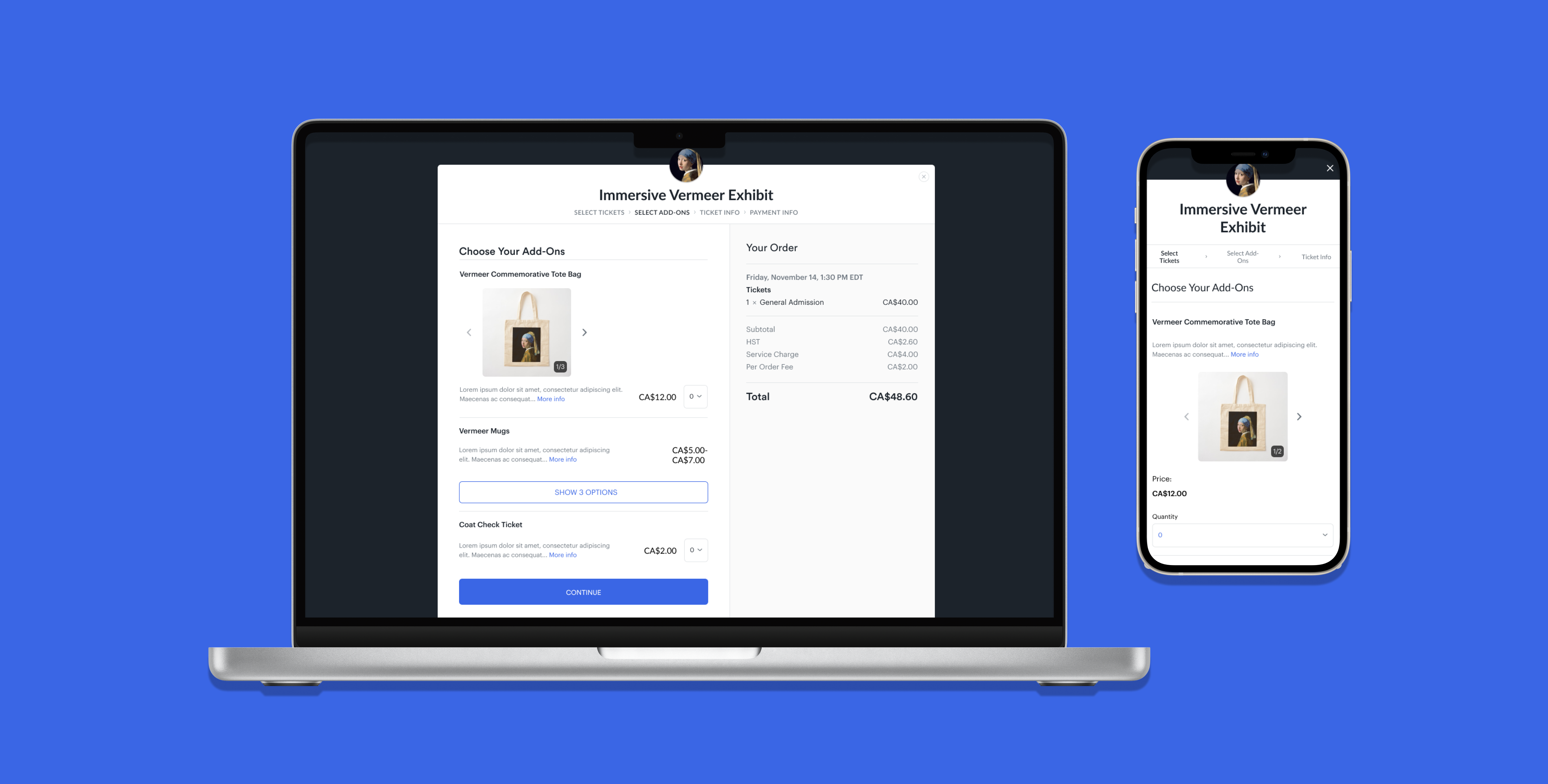
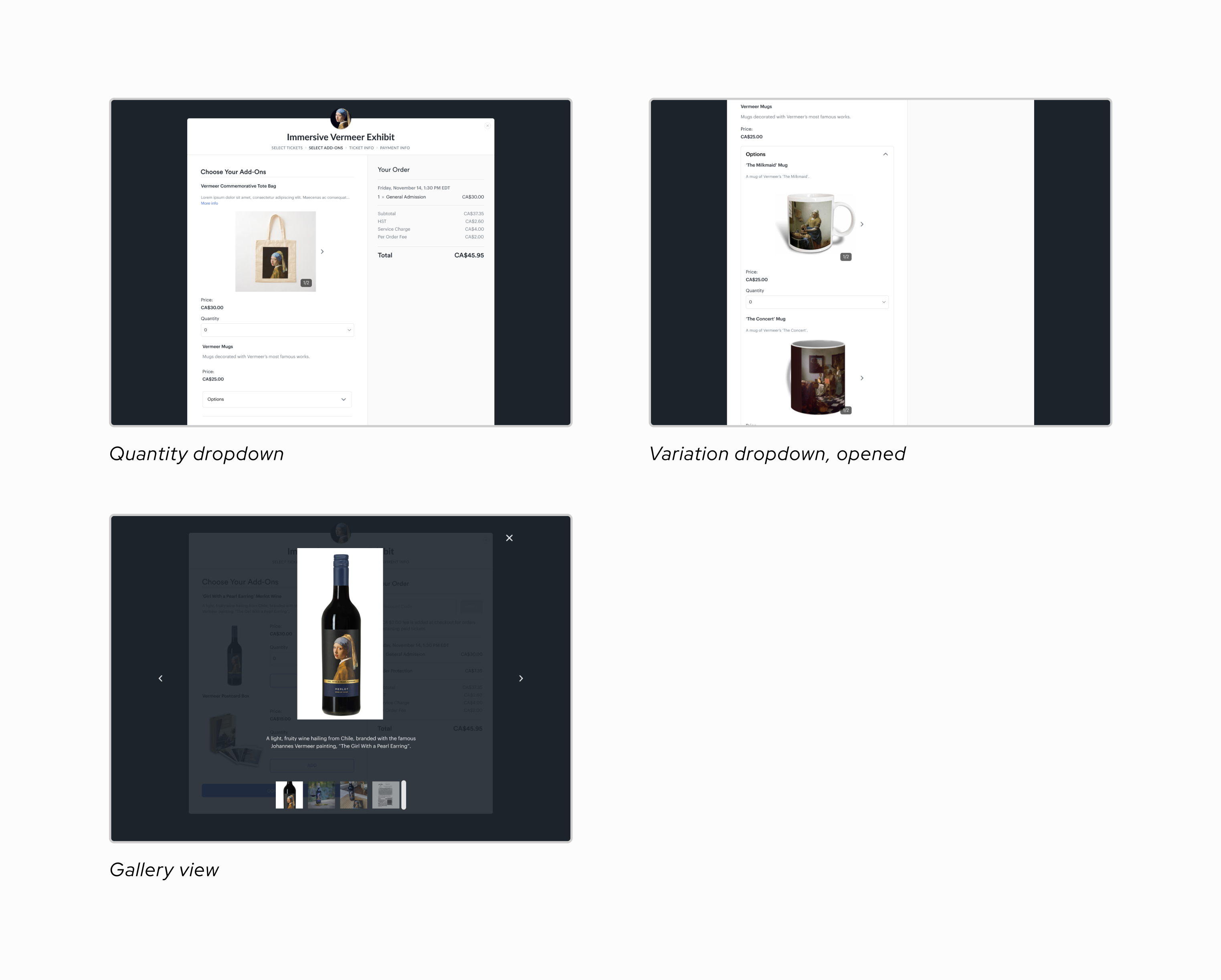
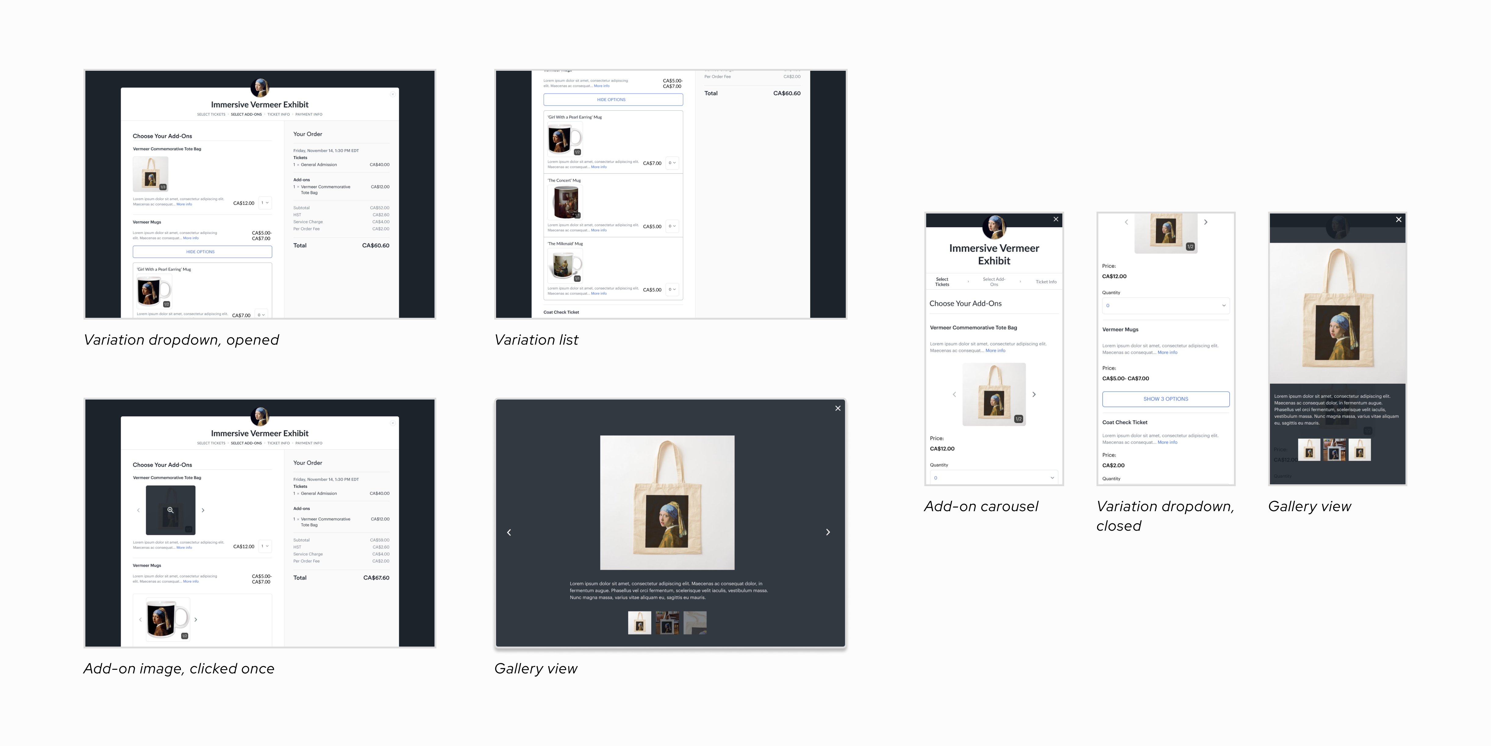
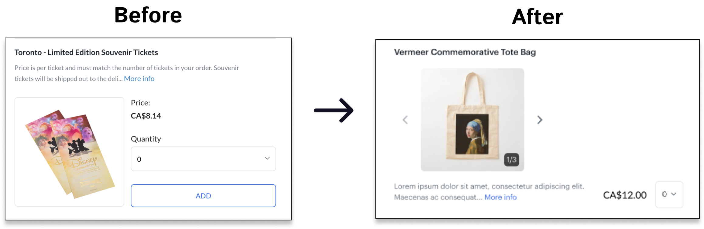
I removed the Add button previously located under each listing, making the add-on purchase flow the same as the ticket purchase flow.
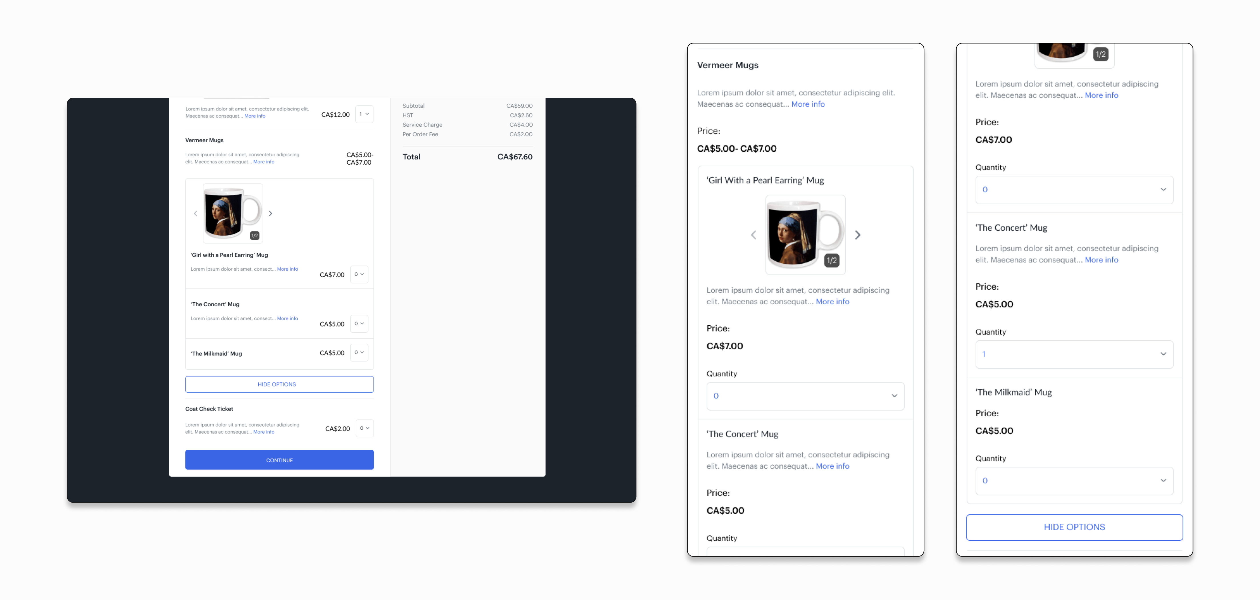
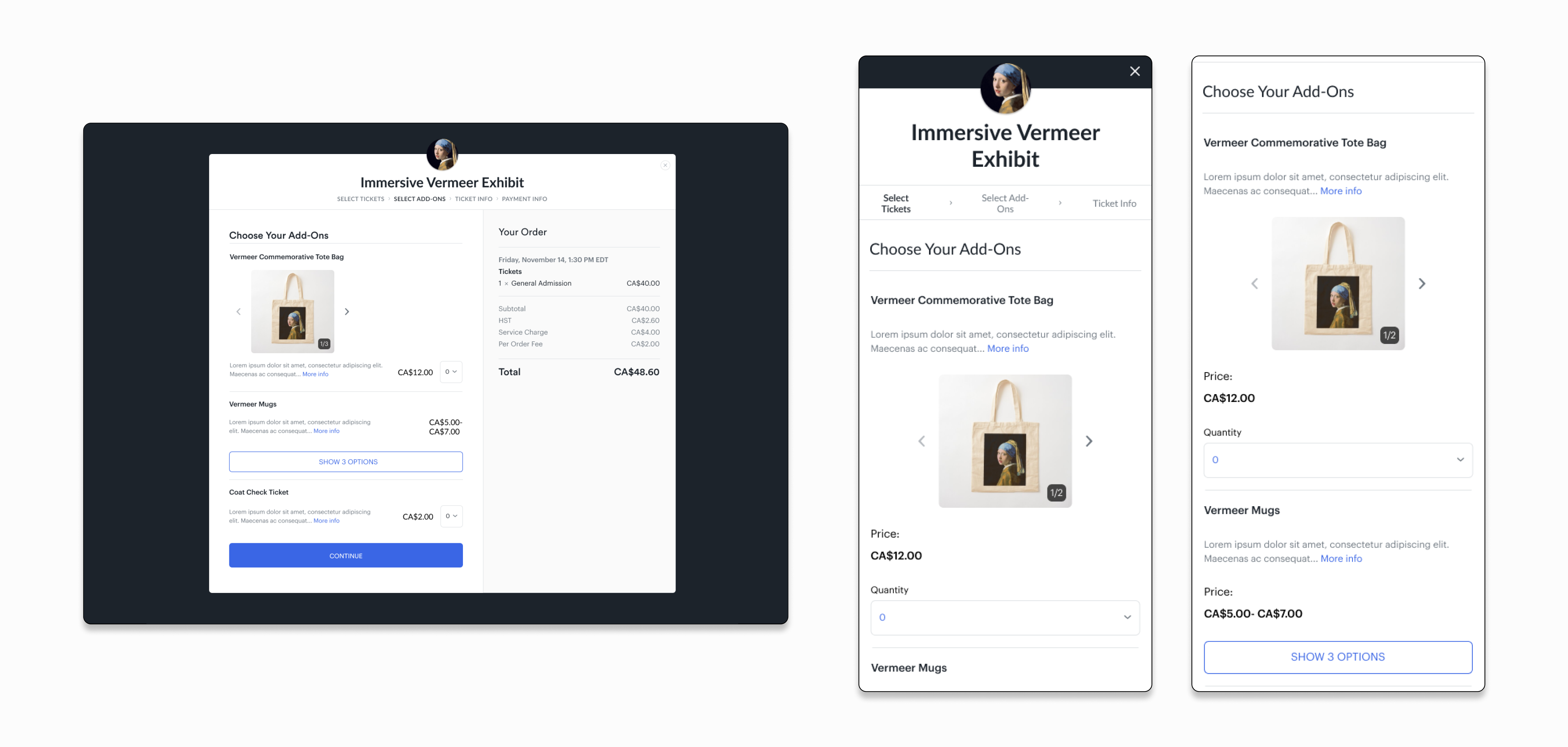
Variations live within a nested dropdown, below the originating item. Users who want to view the variations can press Show Options.
When an add-on image is clicked, a gallery view appears. Users can view multiple, zoomed-in photos with descriptions.
The classic "Add to Cart" function had different behaviours between the ticket purchase stage and the add-on purchase stage, which caused confusion and occasionally a loss in add-on revenue.
The teams that interface with Universe's clients learned of cases where three specific features would be useful: 1) being able to purchase add-ons after ticket purchase confirmation, 2) the ability to buy add-ons without a ticket and 3) the ability to have multiple photos for one add-on
Add-on listings could be confusing for customers, especially when it comes to variations (different designs of one product, for example: different colours of one mug) because there was no visual hierarchy or delineation in these instances.
The product designer and product manager were working on the host-side of the add-on checkout experience. They had conducted interviews and created preliminary designs.
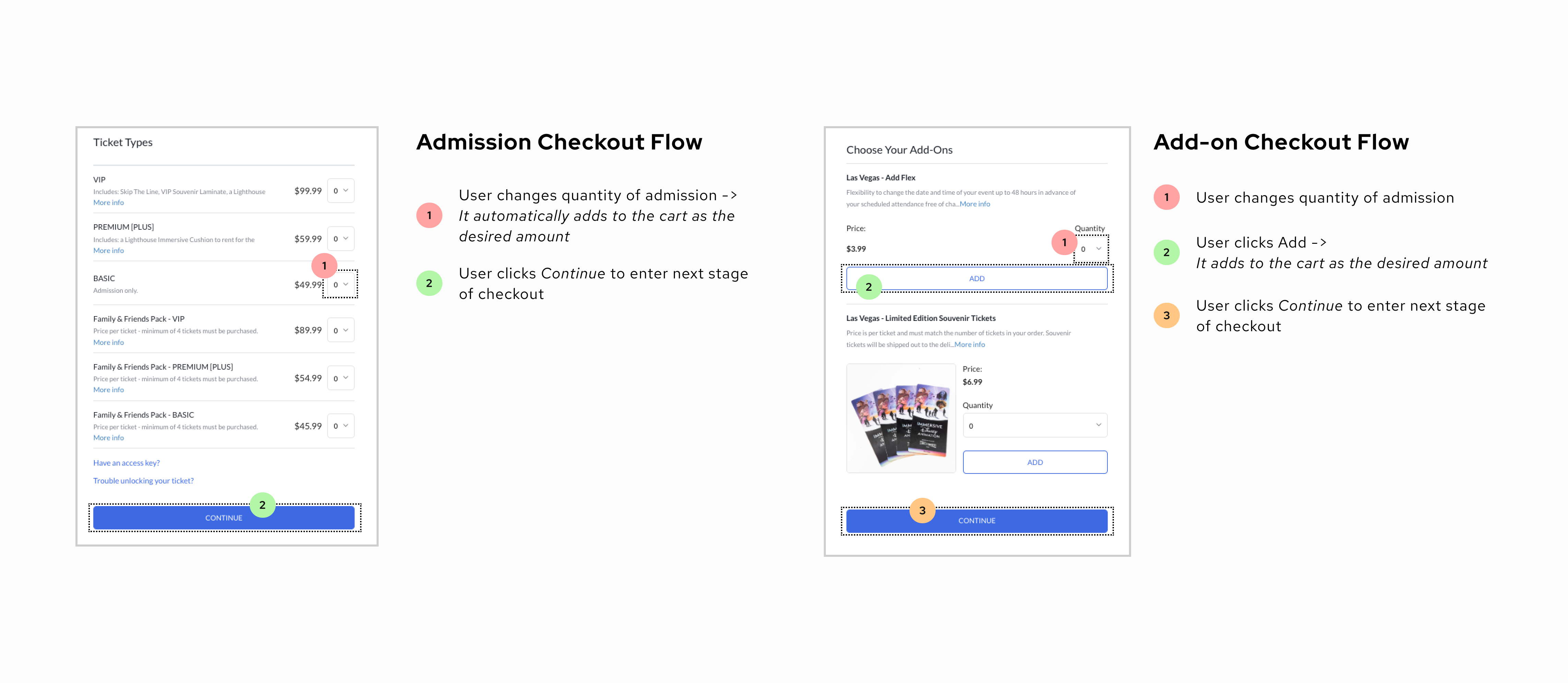
Ticketing platforms follow an identical flow for the purchase of admission; it allows users to follow a recognized (and therefore, intuitive) pattern across all platforms. Conversely, add-ons take on a different visual/technical approach depending on the platform. We needed to understand where Universe existed in the market.
All competitors followed a checkout flow: add-ons being a step after ticket choice, and a step before checkout
All competitors had the same button function; users click the "add" button and it automatically adds to the total
Event organizers are given some liberties in the design of their event's checkout, like visual design and user experience
Technicalities considered, we also needed to consider how our users respond to the current add-on checkout process. We needed to centre our work on users (event-goers and hosts). I sought to paint a picture of each persona's frustrations of the current flow.

From the research, we understood that two improvements were of high-priority, and justified deep exploration:
1
2
Based on our communications with other Universe teams and gaps in the market, we also believed these features would hold value for users and hosts:
3
4
5
We needed to visualize how our users were ideally meant to go through these features, and see the gaps or potential causes of confusion throughout.


During the iterative design process, I focused on finding a solution to display variations, especially in tandem with the add-to-cart functionality, because both had to work smoothly with one another for this stage to function properly.
The gallery feature already existed on other areas of the platform, but a description did not; I wanted to show its value here.
To reduce mental load for users, I designed the add-to-cart functionality on the checkout process side to be the same as the admissions checkout
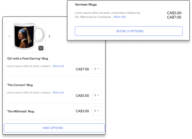
This UI change organizes variations into their own box, instead of having them displayed as unique add-on listings, which lowers cognitive overload, and supports the automatic add-to-cart functionality
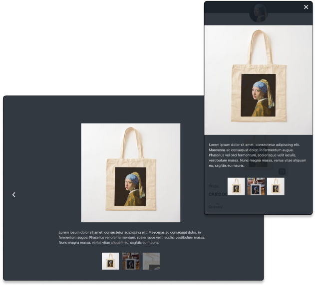
Provides additional information for event-goers, so they can make informed decisions!
Summer 2024 marked a time of deep learning and growth for me; I was exposed to new processes, added new skills to my design toolbox, and connected with wonderful people. Some key takeaways:
While designing for this project, I learned that it's vital to consider the product in all its possible iterations: common usages, long descriptions, lack of photos, edge cases.
I collaborated with the Product Management Intern throughout this project, communicated with different teams during the research period and received guidance from the product team; it drilled in me the importance of consistent, detailed and honest correspondence!
I began my design work from a desktop-first approach, which, in hindsight, was the wrong way to go about this project. Users check out on Universe through their mobile devices 80% of the time, so I should have considered mobile earlier in the design process and worked with both the desktop and mobile versions side-by-side.